Wara App
Wara: Mindful Journaling App

Wara (from the Ghanaian word for “You”) is a journaling app designed to make self-reflection approachable, minimal, and emotionally resonant for Gen Z users.
The Problem
Most journaling apps are built for people who already journal. They open with a blank page, a blinking cursor, and no direction. That blank page is the single biggest reason people give up.
The problem isn't motivation, it's initiation.


Design Goals
Make starting frictionless : Zero decision-making to write the first word
Reward showing up, not output : Two sentences earns the same streak as two pages
Make the past feel alive: Entries as memories, not records
Grow with the user: Free tier is genuinely useful, premium adds depth
Design Process
Information Architecture
I mapped the full user journey from app install through to 30 days of consistent use. The key insight here was that the critical moment is not onboarding, it is Day 3. That is when novelty wears off and habit either forms or dies.
Wireframes & Key Flows
I wireframed four critical flows on paper first: onboarding, creating a new entry, browsing past entries, and the upgrade path. The paper stage forced me to make structural decisions before falling in love with visual details.
Visual Design System
I defined the design language before building a single screen.
Typography: Instrumental serif Display for all display headings and titles: it carries warmth, stillness, and literary quality without feeling pretentious. Inter for all body, UI labels, and functional text, neutral, modern, highly legible.
Colour: A single dominant purple family anchors the app. Soft cream backgrounds instead of pure white reduce visual tension and feel closer to paper. Gold is used exclusively for premium, it carries earned status without aggression.
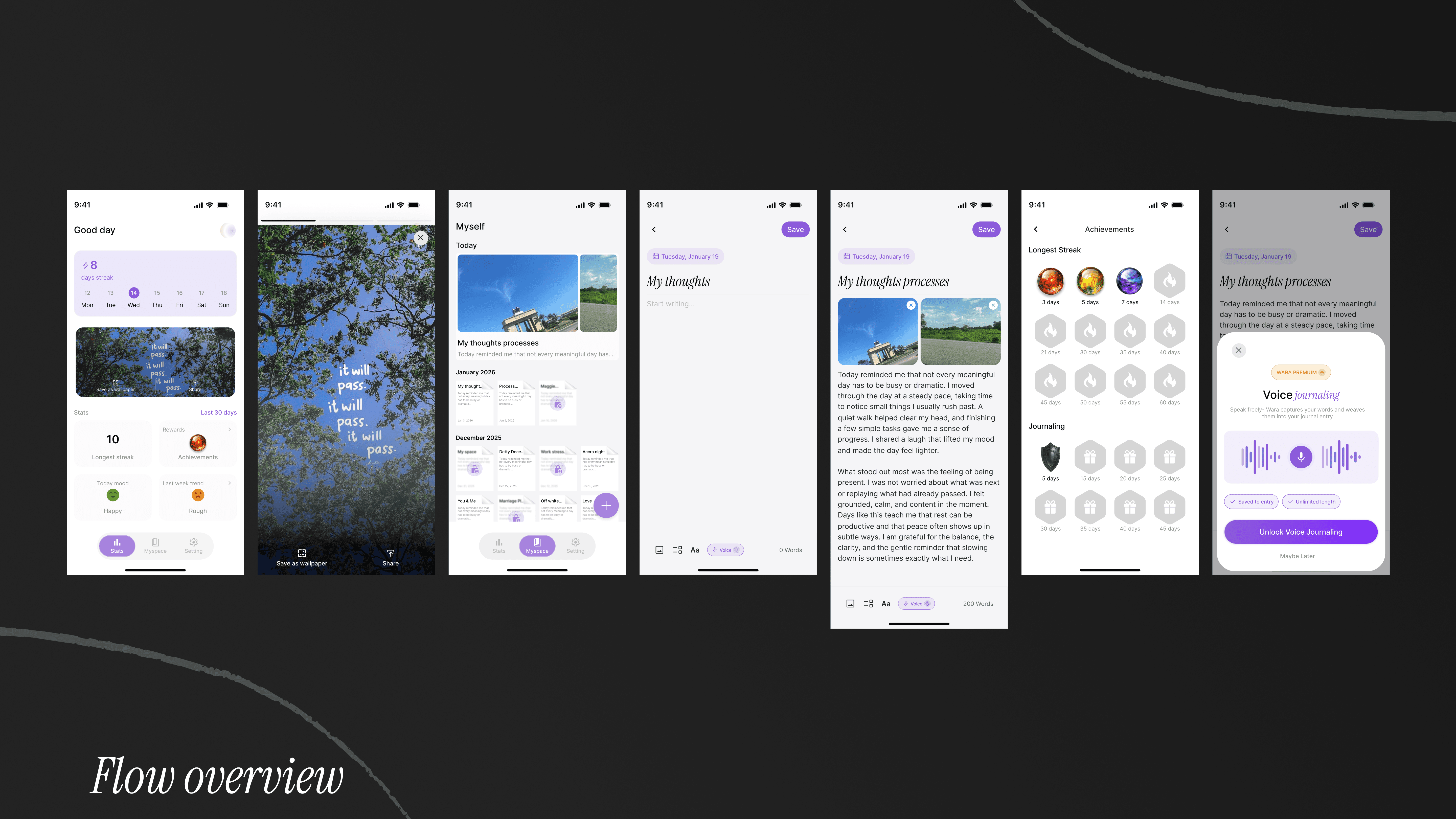
Key Screens
Splash & Onboarding
Onboarding Questions
Paywall
Homescreen
Myself-Journal Library
Settings


Outcome & Impact
This was a self-directed design project
Built to demonstrate a complete product design process, from problem identification through to a production-ready, interactive prototype. The outcomes I measure are design outcomes:
Clarity of flow. A user can go from app open to words on the page in under 30 seconds, with zero dead ends or confusing navigation states.
Monetization model. The free tier is genuinely useful (home, streaks, basic journaling, mood tracking). Premium adds real depth (voice, unlimited writing, passcode, themes, insights). The upgrade path surfaces naturally through PRO badges and contextual toasts, never through hard gates.
Emotional coherence. Every touchpoint, the copy, the colours, the typography, the micro-animations reinforces one idea: this is a space that belongs to you, and you belong here.
Technical feasibility. The entire prototype is built in Figma: Every interaction, animation, and state transition is functional.

